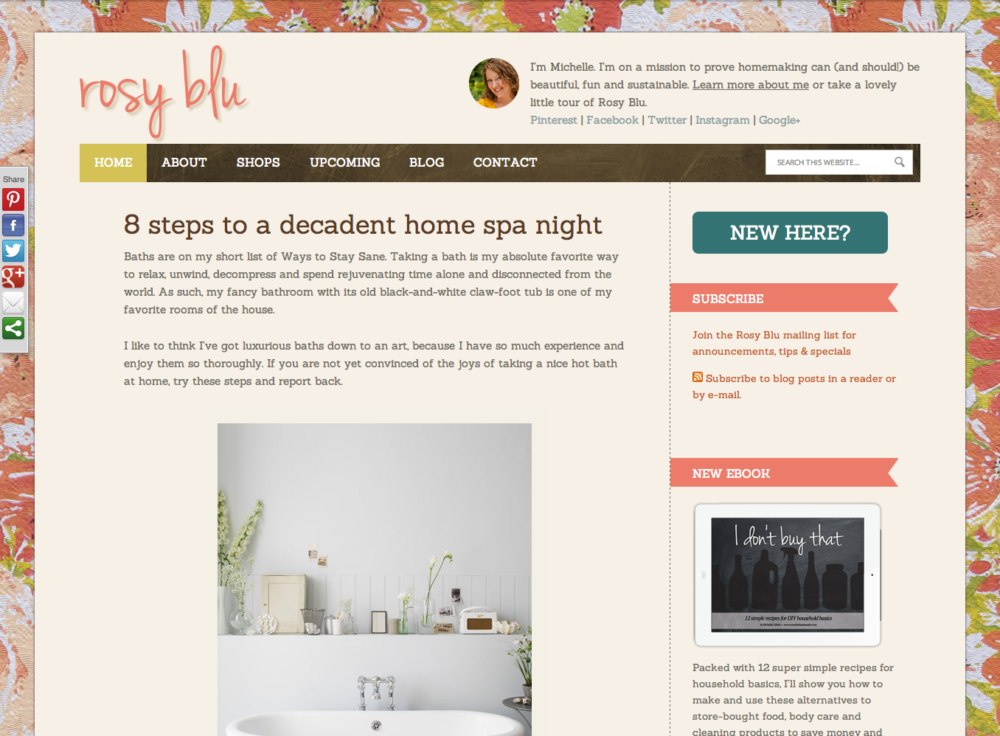
Welcome to the new and improved Rosy Blu! (Those of you reading in an RSS reader or an email are going to want to visit the website to see today’s post.)

(You know what would have been cool? A screenshot…of the screenshot…of the screenshot…just like Steven Colbert’s mantle portrait.)
Since Sunday afternoon, I’ve been redesigning and tweaking the Rosy Blu website and I’m finally ready to show it off to all of you. In addition to a new look & feel that reflect the brand better, I’ve simplified the layout, allowing more space for blog posts (and big images!) and added a page for new readers to help them get to know what Rosy Blu is all about. (Even though most of you reading this are most likely already acquainted, go on over and take a look! Maybe you’ll learn something you didn’t know already.)
I’m not quite done with changes—in fact, my list of updates & enhancements for the next few weeks and months is quite long—but for now, I’m quite pleased.
Have a beautiful day, my darlings! Rosy loves you.