Hello, friends! As promised, I finally took pictures of our completed painting project. I already showed you the in-progress pictures when we found all kinds of cool stuff underneath the layers of wallpaper. I dug through my old pictures and found these two of the room before we even moved in, which show the old wallpaper in all its glory.
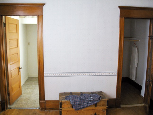
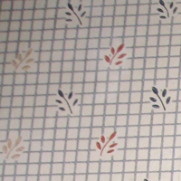
See that plaid fabric on top of the trunk? That’s what the curtains looked like. We never hung them up.
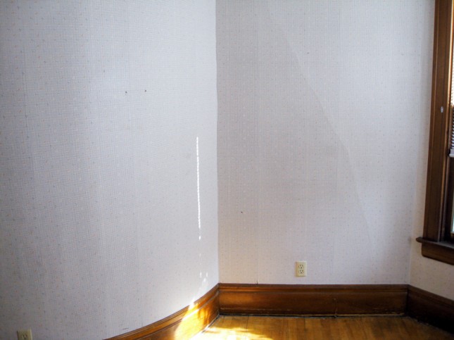
Here’s the curved wall side. You can see a faint crack going diagonally down the flat side of the wall…that’s where the plaster was split and being held together by the wallpaper. We ground it down and filled it with more plaster and you can barely tell it was even there. And now:
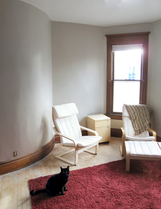
We painted the walls a warm gray, and the ceiling white. Obviously, the painting project is not quite finished–there are some little things to wrap up, like some detail cleaning with a toothbrush, and Jon is putting the outlet covers on as I’m writing this post. But for today, we’re extremely happy with the improvement. In the last two weeks we’ve been using the room a lot more. I went to Ikea this weekend and bought a second chair to match the one we already had, so Jon and I can both sit in there at the same time now (woo!).
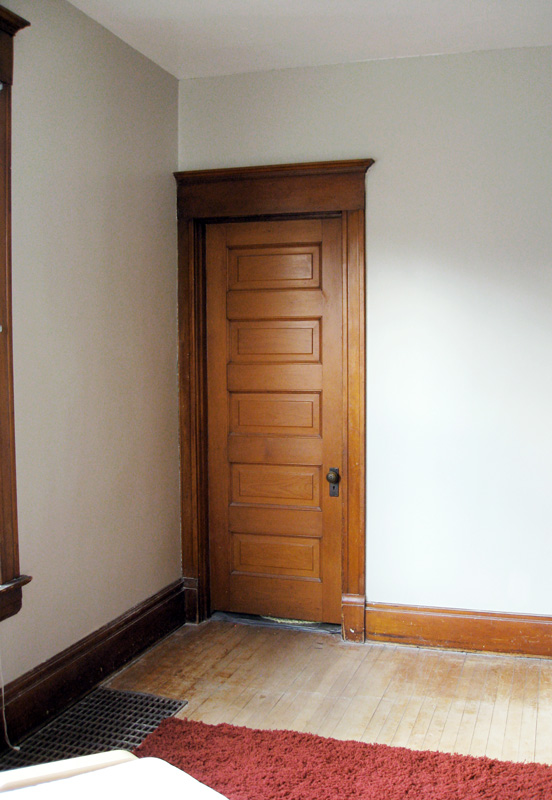
We have a big (and old) beast of a TV that is currently residing in to the left of the door above, between the bathroom and the closet. It’s an ugly monster, and we’re going to be replacing it within the next few months with a nice flatscreen that will blend in to the landscape a bit better.
The fun thing about this room is that we’ve pretty much gotten rid of the furniture that used to be in it. We were using a lot of hand-me-downs that we didn’t love, so we decided to only add back in what we really wanted, which is minimal at this point.
So the room is very much a blank canvas. Next we will choose a color scheme and start adding decor to make the room more finished and cozy. Someday we’ll sand and re-varnish the floors, which badly need it, but we want a rest before tackling that.
A few things I know we’ll be incorporating include this print from Etsy (color is “River Rock”, ours is a beige brown rather than gray as shown below):

And a poster-sized framed print of the Creation of Adam:

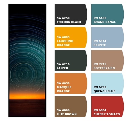
My favorite color scheme of the moment is this one. I love that it pulls in the tan and brown shades already in the room; a pop of yellow and orange, which would tie in with the adjacent dining room; plus red (so we can use the rug that’s already in there); and turquoise, which is easily my favorite color. I have a turquoise throw pillow we got antiquing on our honeymoon that would work wonderfully.
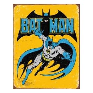
Jon has requested a vintage metal poster of the old Batman comic, which would totally work:
I have a board on Pinterest with some of my inspiration for the room. The common themes are bohemian, groups of framed art, long draping curtains and bright pops of color. It will take us a while to plan it all out and pull the pieces together…but when I do, I’ll have more pictures for you!
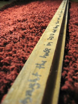 And one more thing…it broke my heart just a little bit when we painted over the pencil drawings on the wall. Jon had a brilliant idea that made up for it though; we took off some floorboard trim before painting and just before nailing it back on, he asked, why don’t we write on the back of it?
So we left a note saying that Hazel and Henry Stevens had wallpapered the room in 1920, then Ruth, Hank and Steve remodeled in 1979, and then Jon and I bought the house, found the notes, de-wallpapered and painted in 2012. I also put a link to this website…wouldn’t it be amazing if someone found it someday?